Product Evolution
Product Evolution
Atlas Coffee Club
2022-2024
Project
Overview
As Product Design Lead at Atlas Coffee Club, I overhauled the customer portal to fulfill our “global coffee tour” brand—centered on young, urban women as our strongest growth segment. We made flavor, region, and seasonality easy and culturally relevant to explore, with rich visual storytelling. The work drove triple-digit gains in order volume, and applying the new design system across new product formats contributed to 20% year-over-year growth.

The design evolution
When I joined the Atlas team as staff Product Designer I was given a lean, startup style brand toolkit in Figma and asked to apply it quickly to a product refresh, without a full brand overhaul.
Below I share key updates I would make to deliver on our the core brand promise: a global coffee adventure delivering an exceptional and diverse roster of coffee origins to your doorstep.

Freshness as a point of difference
As I gathered the human stories from my teammates, I learned that we sourced and delivered coffee in the season it's grown in, and worked with my PM teammates to highlight that compelling brand difference in our communications.
Having successfully launched Nespresso pods during my time, Atlas entered a more premium market space, and I see this freshness story as an important signal to prospective subscribers that we deliver exceptionally high quality coffee.

Brand System evolution
Over 18 months at Atlas, I built a scalable Figma component system that supported our migration to Shopify. I worked closely with my engineering counterparts to design a new style system that was optimized for iOS and Tailwind CSS, using a code reference library to align with Google Material Style UI. Components and page layouts were sized in increments of 8 pixels, for build efficiency in Tailwinds CSS.
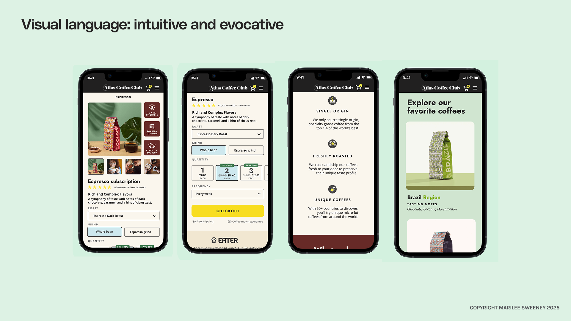
Making it delicious
I loved infusing the new brand system with lush colors of coffee origin together with mobile friendly, iOS optimized components. Our new style system was particularly helpful in dense screen scenarios like the product detail page. In moving forward I would play this out in all of our surfaces, removing hard blacks and dull browns.
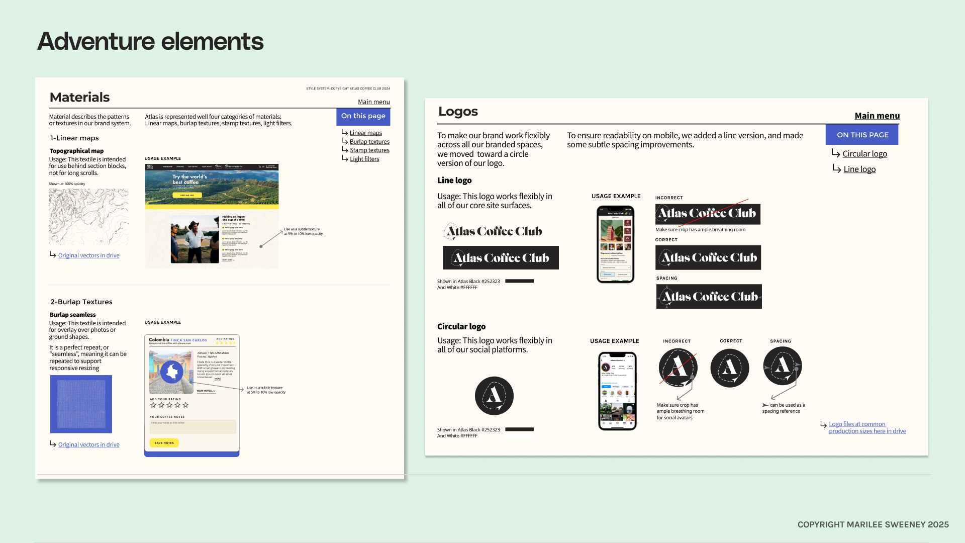
A worthy logo
Rebranding wasn’t in scope for our visual refresh while I was on the Atlas team, but I flagged that the logo needed a refresh, and that it lost legibility at small sizes. As a follow on in this case study, I played with our circular mark and a line version–a lightweight logo update that would be more readable. I also played with trajectory lines and arrows, evoking the energy of global exploration.
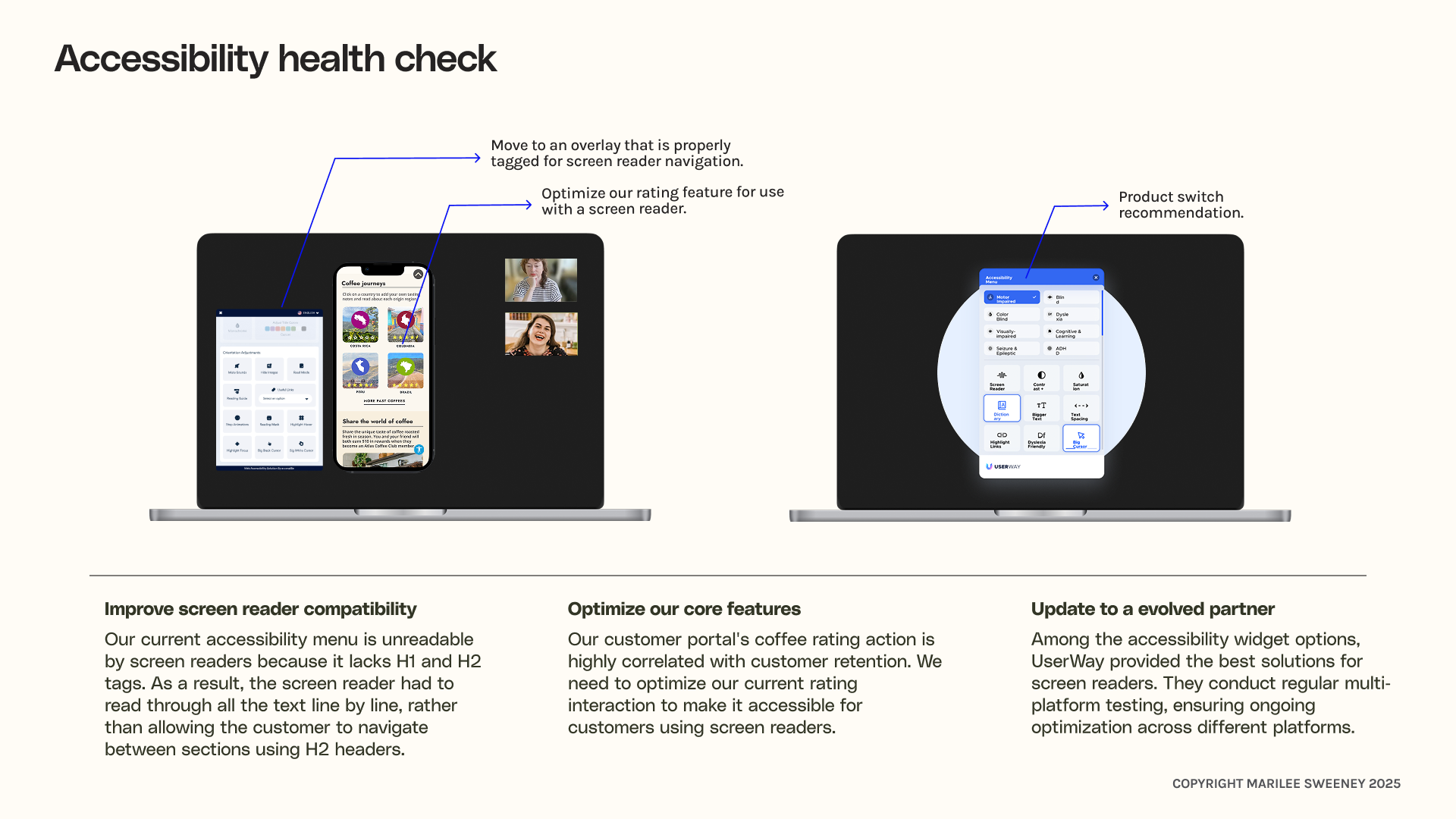
accessibility testing
As part of optimizing the experience, I connected with a blind customer, and facilitated a usability testing session with them. This surfaced issues with our accessibility overlay, and I documented these issues for our engineering team with recommendations for improved accessibility tools.
Our current accessibility menu was unreadable by screen readers because it lacked proper H1 and H2 tags. As a result, the screen reader had to read through all the text line by line, rather than allowing the customer to navigate between sections using H2 headers.
