Customer Portal Evolution
Customer Portal Evolution
Atlas Coffee Club
Q1-Q4 2024
Project
Overview
As Product Design Lead at Atlas Coffee Club, I refreshed our customer portal to deliver on our brand promise of 'a global coffee tour'. I created a system of iOS-style cards that showcased origin images and invited customers to explore flavor, region, and seasonality more directly. I also evolved our upsell ads so that our core customers could see themselves in the brand, which drove exceptional growth.
the ask
Make updating subscription details intuitive and quick. Introduce juicy features that lift cart volume. Avoid driving users to cancel their subscription.
the challenges
Atlas had gained recognized as a top coffee subscription brand, often featured in Wirecutter’s top lists. But after 12 years in business, the platform was complex and inconsistent to navigate. Our UI needed an update to a mobile-first design system asap to drive growth.
the outcome
I introduced a cohesive, mobile-first design system anchored in iOS-friendly card components. This allowed our young, urban customer cohort to move quickly through core subscription tasks, then dive into the coffee origin stories they came to us for. These design evolutions increased engagement and contributed to triple-digit growth in cart volume.

pushing through complexity
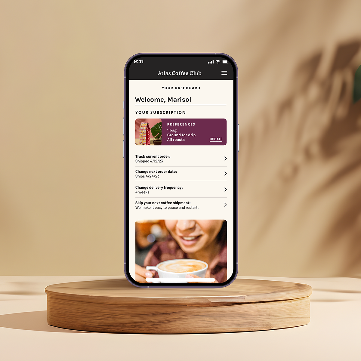
As we transitioned to Shopify and the Tailwinds code base, I evolved our portal UI to iOS style cards, making core changes to a subscription quick and highlighting our coffee origin stories in interactions that were intuitive and juicy. I worked closely with my team to move us into a mobile-first design system, anchored in iOS style card interactions.
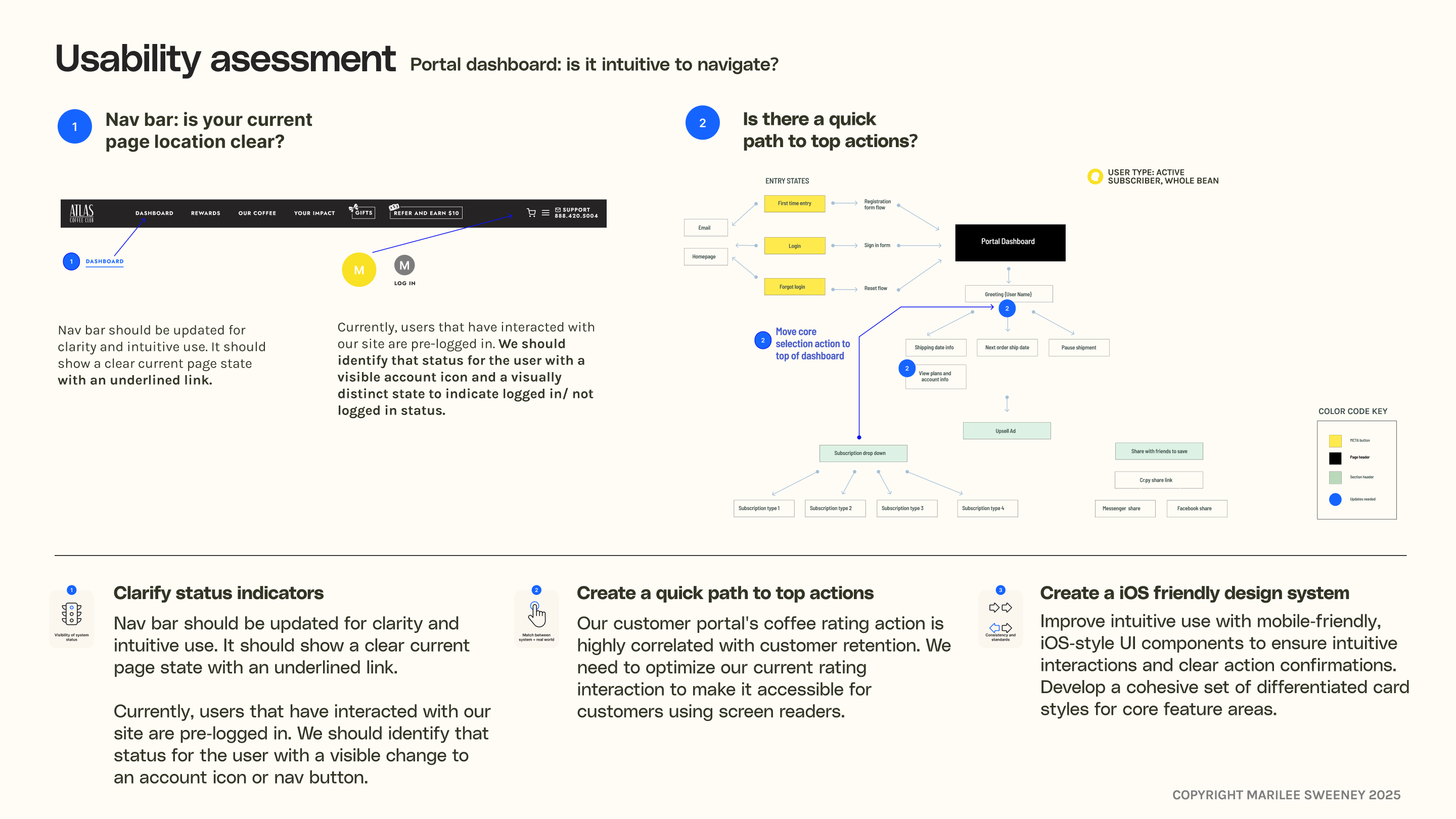
Adding clarity
I presented product and competitor audits to my team, winning their buy in for clarifying our information architecture, moving to the nomenclature norms for subscription apps.

Giving our customers what they want
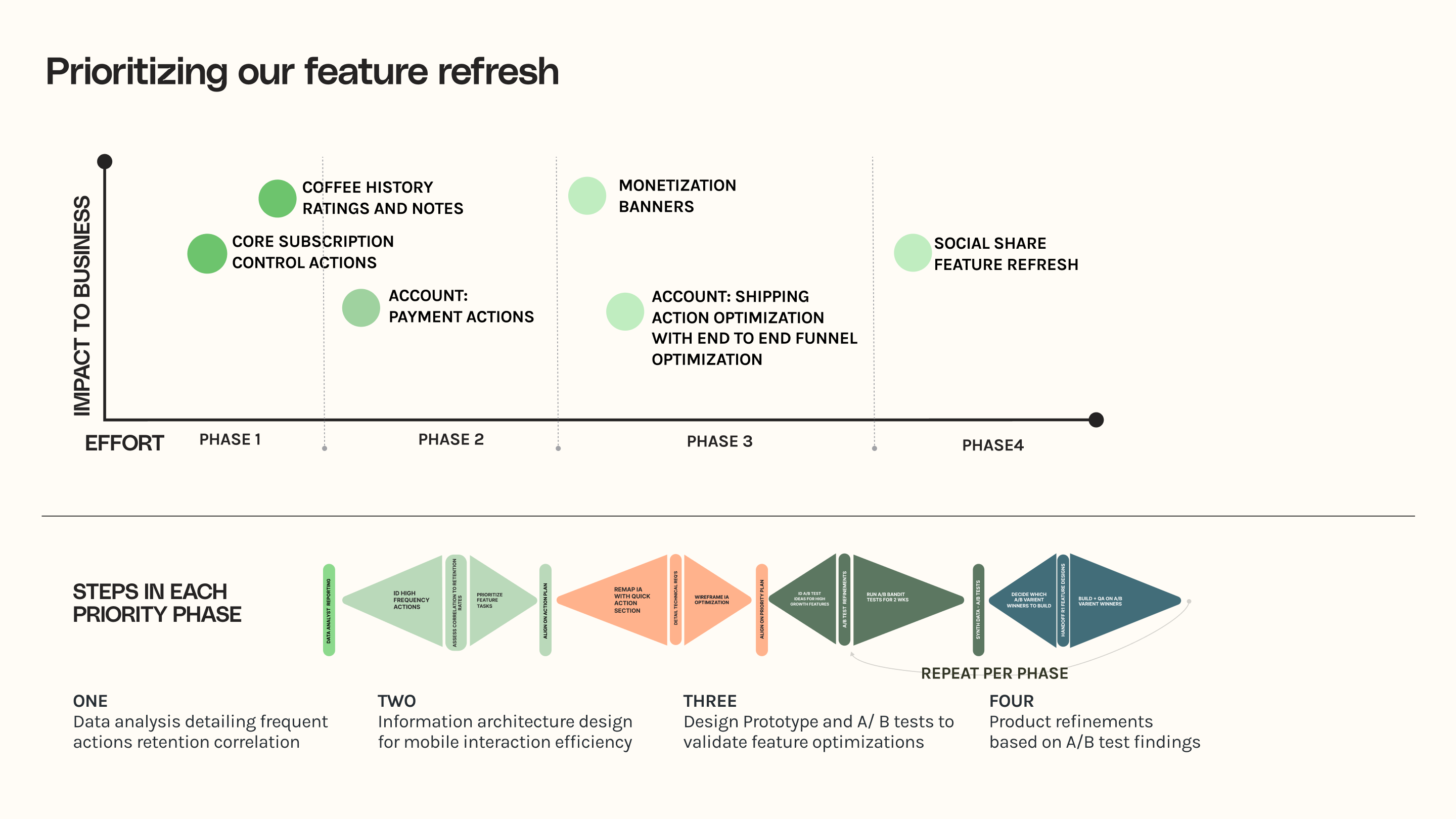
Our team conducted retention and click-rate analyses to understand how subscribers were actually using the portal, and what behaviors correlated with long-term loyalty. Combined with my qualitative research, the signal was clear: customers wanted to explore coffee regions more deeply and keep personal notes on each month’s origin.
Using our click-frequency data, I restructured the portal layout to reduce clutter and make core subscription actions immediately accessible. The most frequent tasks were elevated to the top of the dashboard for quick use, while lower-frequency items were moved into a clean, mobile-friendly kebab menu.
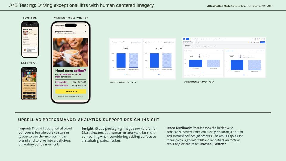
delicious visuals
I guided our storytelling in a customer-centered direction, with the hypothesis that if you show your target audience a tantalizing moment they recognize themselves in, and they’ll dive in—deepening their connection to the brand and fueling growth.
Creating continual upward growth
We conducted several rounds of A/B testing against our prior Ads, and our first Variant drove triple digit cart volume growth with the new Ad images and layout. I created a library of images that would have a similar growth impact for seasonal releases, and we continued to see outstanding upsell growth.

a new portal to coffee regions
Our research clearly signaled that our customers came to us to explore new coffee origins. It was a great pleasure to cull through the visuals and stories my team had tucked away and truly deliver on our promise of “a global coffee tour.”
I built a relationship with our Sourcing Director and together we encourage our team to travel to our producers more. Our trip to La Minta in Costa Rica Tarrazu region was stunning and delicious-we captured our own experience of our partners there and sharing it back with our customers so they could see coffee through our own unique lens.
