A Branding Remix
A Branding Remix
Rev Event Production
Q2 2019
Project
Overview
I collaborated with Rev Events Production to create a new visual identity that matched the finesse of their Audio-Visual services. Jarrin, the founder, brought me on to launch new design services, and Rev needed a flexible system that would signal that we were a creative force.

The Ask
Create a visual system with a premium audio-visual aesthetic that showcases Rev’s new creative capabilities to event clients.
The Challenge
Rev was a boutique business–Jarrin needed a premium aesthetic without spending a ton of cash to produce branded event items.
The Outcome
Over the course of three months, I developed a new visual system with an audiophile flavor. The end result reflected Jarrin's personality––a magnetic producer with a love for high-end tech gear.
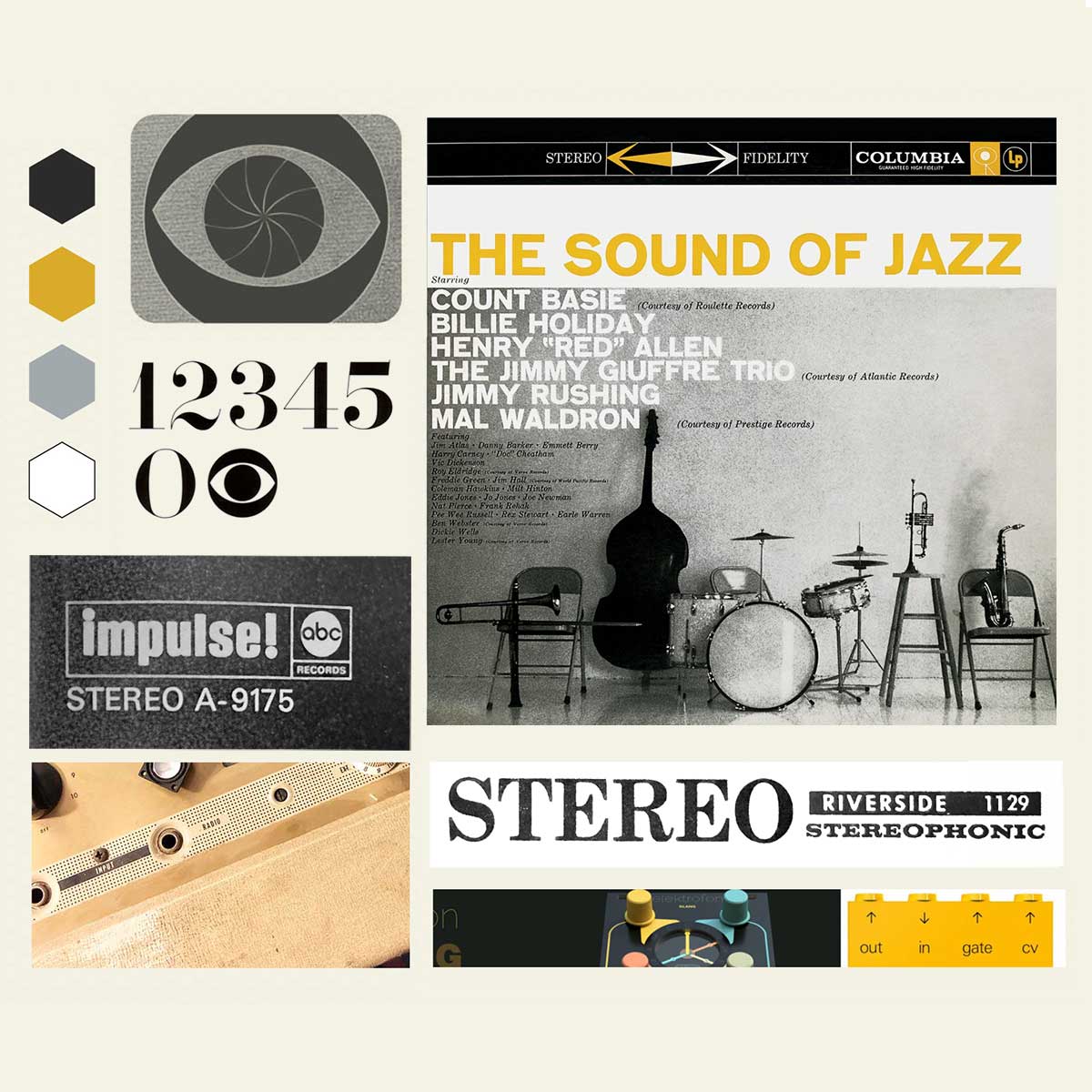
Vintage Frequency
I drew inspiration from classic vinyl iconography of the 1950s and ’60s, referencing labels like Riverside Records, Blue Note, and Impulse!

adding Textural dimension
One of my favorite ways to add premium depth to a brand is through textile design. I created a sleek, sound wave–inspired signature pattern that added a tactile, dimensional layer to the brand.

marking a unique Identity
I explored subtle markings noting that Rev had it's home base in Portland, Oregon (PDX). This lighthearted notation evokes a sense of immediacy and spontaneous creativity in the culture of Portland.

Scale testing the brand
I designed the new marks to flex to execute well and affordably-both at small digital scale and oversized banner scale.

Scale testing the brand
I love to test branding on a wide variety of applications right away-and was pleased to find that my new marks looked great and executed well on banners and crew apparel.
